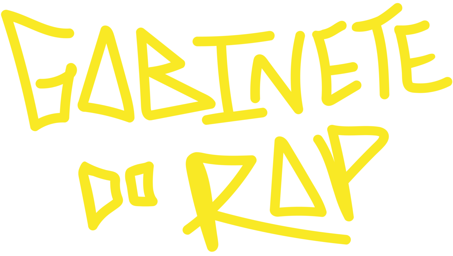
Punk Logo Design — Chaos Meets Calligraphy
Punk Logo Design — Chaos Meets Calligraphy
When you think of punk rock, your mind might jump to ripped jeans, spiked collars, or the raw energy of a three-chord anthem. But there is another element that captures the spirit of the rebellion just as vividly: the logo. A punk logo is not merely a brand mark; it is a visual scream. In the world of punk, design moves far beyond clean lines and corporate minimalism. Instead, it thrives on a deliberate collision of disorder and artistry. This is where chaos meets calligraphy, and the result is as unforgettable as the music itself. For a deep dive into this aesthetic, many enthusiasts turn to punkrocker.org for a look at how these symbols are born from attitude.
The beauty of punk logo design lies in its rejection of perfection. Traditional calligraphy often conjures images of elegant script, flowing ink, and disciplined strokes. Punk takes that foundation and literally tears it apart. Letters might be slashed, scratched, or drawn with a spray can. The ink might bleed outside the lines, or the typeface might look like it was carved into a desk with a pocketknife. Yet, within that apparent mess, there is a profound sense of intent. The chaos is not random; it is a controlled explosion, a carefully crafted rebellion against the sterile, the polished, and the safe.
The Raw Aesthetic — Why Imperfection Wins
In the punk world, a logo that looks too clean is often seen as inauthentic. The rough edges, the uneven spacing, and the aggressive angles communicate something that a sans-serif font never could: urgency. This aesthetic borrows heavily from DIY culture, where logos are often handmade, photocopied, or stenciled onto flyers and album covers. The medium becomes the message. A jagged, almost illegible logo tells the viewer that this is not a product designed for mass consumption; it is a battle cry.
Consider what makes a punk logo memorable. It is not the symmetry but the imbalance. It is the way the letters seem to fight against each other, leaning left and right as if trying to break free from the page. This visual tension mirrors the music itself—chaotic yet structured, aggressive yet meaningful. The best punk logos feel like they were drawn in five seconds by someone with something to say, and that raw, unfiltered energy is their greatest strength.
When Lettering Becomes a Weapon
Punk calligraphy is not about elegant flourishes. It is about impact. The strokes are often thick and aggressive, mimicking the sound of a distorted guitar riff. Descenders become sharp spikes, ascenders turn into jagged points, and every curve seems ready to strike. This approach turns the logo into a weapon of expression. It is a form of visual protest where even the shape of a letter can convey anger, defiance, or solidarity.
Another key element is the use of contrast. Many punk logos pair chaotic, hand-drawn text with stark, blank backgrounds. There is no room for subtlety. Black ink on white paper, or white spray paint on a dark wall, creates a high-contrast scream that demands attention. The lack of gradient or shading reinforces the punk ethos of directness. The logo does not ask you to look; it forces you to see.
Key Characteristics of Punk Logo Design
To understand the anatomy of a punk logo, take a look at these common traits that define the style:
- Aggressive typography: Letters are often slanted, broken, or overlapping, creating a sense of movement and urgency.
- DIY handmade feel: Logos frequently mimic the look of felt-tip markers, spray paint, or scratched lines, avoiding digital perfection.
- High contrast: Bold, monochrome palettes are favored to maximize impact and readability from a distance.
- Asymmetry and imbalance: Letters may vary in size, tilt, or weight, intentionally breaking the rules of traditional typography.
- Cultural references: Many logos incorporate anarchic symbols, safety pins, or elements of protest, tying the design back to the movement’s roots.
From Skateboards to Band Shirts
The influence of punk logo design extends far beyond music. It has seeped into skate culture, underground zines, street art, and fashion. A punk logo on a t-shirt is not just a brand; it is a badge of belonging. It identifies the wearer as part of a tribe that values authenticity over polish. This crossover appeal has kept the aesthetic alive for decades, evolving while staying true to its chaotic roots. Whether it is a band emblem or a streetwear label, the punk logo continues to thrive because it speaks a language of rebellion that does not need to be translated.
What separates punk logos from other rebellious designs is their enduring influence on graphic design as a whole. Many modern designers borrow punk techniques—distressed textures, cut-out lettering, and clashing fonts—to create a sense of rawness in their work. The irony is that what started as an anti-design movement has become a source of inspiration for entire generations of visual artists.
Comparative Table — Punk vs. Traditional Logos
| Feature | Punk Logo | Traditional Logo |
|---|---|---|
| Visual Style | Chaotic, aggressive, handmade | Clean, symmetrical, polished |
| Typography | Broken letters, uneven strokes | Uniform fonts, consistent weight |
| Color Palette | High contrast, mostly black and white | Often multi-color or gradated |
| Emotional Tone | Rebellious, urgent, raw | Professional, trustworthy, calm |
| Production Method | DIY, spray paint, cut-out, hand-drawn | Digital software, vector art, precise |
The table above illustrates just how stark the difference is. While traditional logos aim for timelessness and mass appeal, punk logos thrive on immediacy and subculture relevance. Both have their place, but only one was born from a broken instrument and a microphone stand.
Frequently Asked Questions About Punk Logo Design
What defines a punk logo style?
A punk logo is characterized by its handmade, aggressive, and often chaotic appearance. It deliberately breaks typographic rules to convey rebellion and authenticity.
Why do punk logos look messy on purpose?
The messiness is intentional. It reflects the DIY ethos of punk culture and rejects the sterile perfection of mainstream design. The rawness communicates energy and defiance.
Can I create a punk logo for my brand without being a musician?
Absolutely. Punk aesthetics have been adopted by many non-music brands, especially in streetwear, skateboarding, and alternative fashion. The key is to embrace the spirit, not just the look.
What tools are best for designing a punk logo?
You can use anything from spray paint and paper to digital tools like Photoshop or Illustrator. The goal is to retain a handcrafted feel, so even a rough sketch can work.
How do I make my logo look authentic, not forced?
Avoid overthinking. Authenticity comes from embracing imperfections—uneven lines, irregular spacing, and bold choices. Study classic punk band logos to understand the balance between chaos and readability.
Is there a difference between punk and grunge logos?
Yes. While both are rebellious, punk logos lean toward aggressive, angular, and high-energy lettering. Grunge logos are often more distressed, textured, and sludgy, reflecting a different musical and cultural mood.